Blog article : Covid-19 -- Visualizing the pandemic
By Roger Beecham, 29.04.2020.
We are constantly told, and those of us in data-driven domains may earnestly tell ourselves, that new data, new technology and new ways of doing science are transforming how we approach the world's problems. I generally cringe at this sort of guff. The whole "data is the new oil" speak has long past its peak. But it's difficult to disagree that, over a pretty short timespan, access to data, and more importantly access to tools for working with data, has grown remorselessly. I've nothing to verify this claim, but I bet the volume and quality of data analysis around the 2008 crash was nothing like that for the current pandemic. Enter "Covid19 github" into a search and you'll be confronted with hundreds of repositories demonstrating how a bewildering array of data related to the pandemic can be collected, processed and analysed.
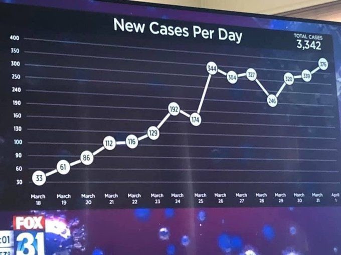
This is great. There's a (slightly nerdy) constituency of people using freely available data to hold governments and decision-makers to account. And as a self-proclaimed data vis person I was initially enthused about coding data graphics comparing exponential growth rates, variation in model ensembles and, inevitably, some snazzy animated maps of disease spread. I've nevertheless held back from this, at least for now. Two reasons: 1. it's easy to make mistakes, especially when creating maps; and 2. a handful of data journalists are currently doing this science communication incredibly well. There are of course outliers, and it'll be great to refresh my showcase of Fox News fails for next year's teaching with this beauty (y-axis!! -- how is this even possible?). Anyway, here's a quick round-up of the more impressive work I've seen and some thoughts on challenges.
On the empirical (cases and deaths) data, best in class goes to the FT's John Burn-Murdoch (non-paywalled equivalent presented with humility by Lisa Charlotte-Rost). I'm sure many of you have seen this, but it compares daily growth in deaths between countries, expressed as a 7-day rolling average. Each country has a common start point in terms of disease presence, rather than absolute time. And because growth is exponential a log-scale is used, with annotation lines providing useful reference-points (deaths doubling every day, week, month). A trawl through John's twitter thread reveals some fierce criticism of this sort of direct comparison. Transmission rates are confounded with a country's population size and density, busyness/connectivity and death rates by underlying demographics. All valid (though the population size critique can be rebuffed) -- and this is before factoring differences in how cases and deaths are recorded between countries. Nevertheless, with different governments instituting different forms of lockdown, these sorts of between country- within-region comparisons seem important.
There have of course been many other variants of between-country comparison, some introducing graphical variety for the sake of it, which is a common pitfall in visualization design. Romain Viellemot's is an exception and nicely uses layout and angle to emphasise variation in the speed at which country-level death "milestones" have been reached. There are also different forms of empirical data and I've noticed a few data vis fails in high-profile publications here. Euler diagrams are rarely ever successful, but somehow found their way into a Nature News article to analyse co-occurrence of symptoms reported by 1.5 million in the UK using a smartphone app. Nils Gehlenborg's take-down of this is excellent, especially so since he provides comprehensive documentation and an array of lightweight tools (Python, R and Vega-Lite) for implementing his UpSet alternative.
A separate class of early-Covid data vis activity was on representing data produced by models -- remember all that curve flattening talk? My favourite here, and a really excellent use of animation, is by Washington Post's Harry Stevens. The purpose of all this was to persuade us on social distancing -- that there could be a range of Covid-realities, which we as responsible citizens have agency in affecting. It's important to remember that this is essentially based on a set of assumptions about an unknown disease on which there is (or was) relatively little empirical data. Something for those of us working in data vis to think about is therefore not only conveying the different estimated risks (or Covid-realities) derived under different model scenarios but also a sense of the uncertainty associated with those risks. Tricky statistical concepts that I've yet to see addressed in the Covid data vis, and I'd recommend reading Matt Kay's thoughts on this.
Alarmingly I'm well beyond the 500-word watermark already and so won't reveal too much more of my recent browsing history. My view is that the excess mortality data -- how many more deaths there are over a specific time range than would be expected -- will now become increasingly prominent for quantifying the impact and collateral damage of the virus, particularly second-order effects. The recent releases of these data make for grim reading, but are necessary right now for evaluating lockdown as a policy.